Website Refresh: Sniff Snaff Snute - Dog Salon & Vet Clinic
Introducing the recent website refresh for Sniff Snaff Snute, a dog salon and veterinary clinic in Lilllestrøm, Norway. The lovely team initially created their website themselves, a beautiful DIY effort that served them well in the early stages. Though as the business continues to grow, it was time to evolve it into something more polished, strategic, and reflective of the high-quality services they provide in the clinic. Here’s a peek at what we focused on for the refresh.


Key priorities for this website refresh:
🌟 Rebuild Each Page with Strategic Layouts
Before: The original DIY site was created with love, but the pages were lacking structure and clear action steps for visitors.
After: Each page was rebuilt with intention, prioritising strategy and flow. Every section now leads naturally into the next, helping visitors understand the services, feel a sense of trust, and take action, whether that’s booking an appointment, exploring the team, or learning about their services.
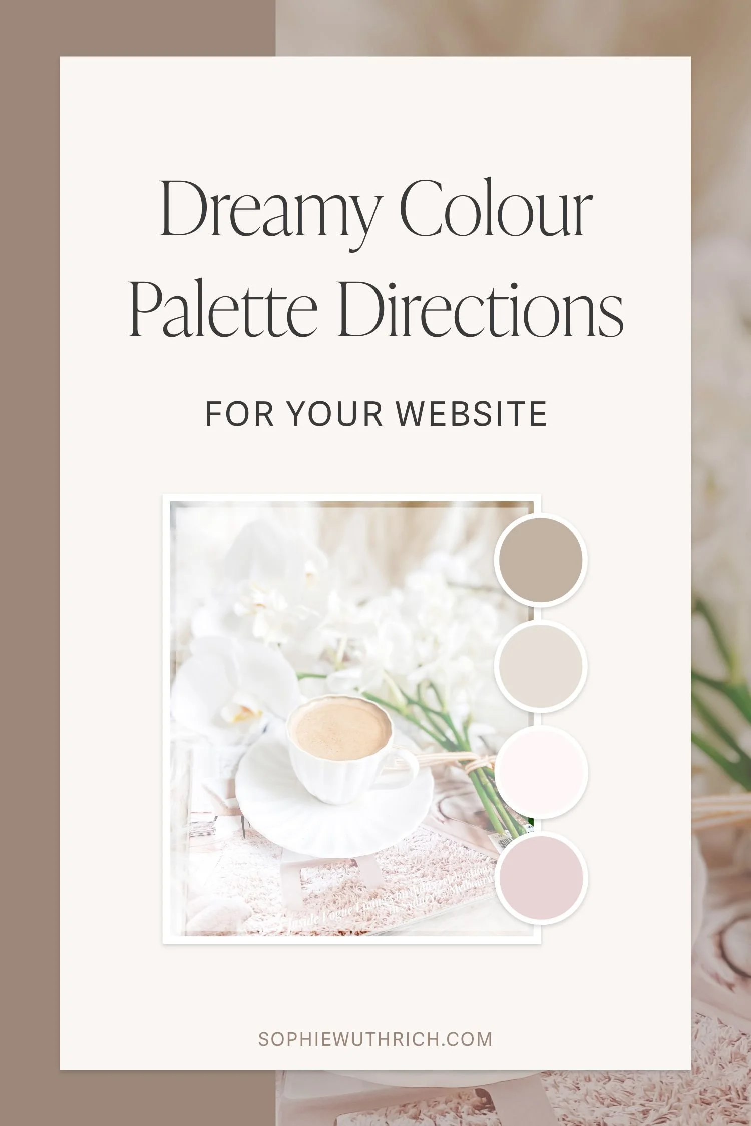
🎨 Refine Their Signature Pink Palette
Before: Sniff Snaff Snute’s signature pink made the brand feel lovable and recognisable, but the overall palette needed more cohesion and refinement to match their elevated in-clinic experience.
After: We gave the colour palette a subtle glow-up, keeping the signature pink palette, but softening and polishing the tones for a more cohesive and premium look that aligns with the quality of their services.
👱🏻♀️ Introduce an ‘About’ Page
Before: The original website didn’t have a dedicated About page, which meant there wasn’t a space to showcase the heart of the team or the story behind the business.
After: We created a brand new About page with professional photos of the team and their furry friends! (Thank you to the lovely Marianne at Newborn Magic Photography for capturing these beautiful photos of the team!) This helps build trust and connection, especially important in a business where people are choosing care for their beloved pets.
✨ The Finishing Details
I added thoughtful finishing touches like a custom site favicon and a custom default profile graphic using brand colours, to use as a temporary placeholder for any team member who wasn’t able to attend the photoshoot. These small details help bring a cohesive, elevated feel across the entire site.


➡️ WHERE STRATEGY LEADS, VISUALS WILL FOLLOW
One of the joys (and challenges) of a refresh is working with what’s already there. While the content structure and visual identity have taken a big step forward, we built the site using a limited selection of existing images.
The new professional team headshots bring so much life to the About page, and over time, refreshing the rest of the site photography will help tie everything together even more beautifully.
Home Page Before (left) & After (right)

Final thoughts
I absolutely loved this website transformation, focusing on strategic layouts that guide the user through their journey, while keeping the brand’s warm personality and signature pink palette.
One of the key goals was to rebuild the site with stronger structure and flow, making sure every page has purpose and direction. This refresh was all about creating a website that not only reflects the level of care they deliver in the clinic, but also supports their growth as the business continues to evolve and thrive.
Kind Words from Elisabeth at Sniff Snaff Snute
“Working with Sophie Wuthrich on our website was an absolute game-changer. From the initial concept to the final launch, they brought creativity, technical expertise, and a deep understanding of user experience. Our site not only looks amazing but also performs flawlessly across all devices. We’ve seen a noticeable boost in engagement and credibility since the launch. Highly recommend for anyone looking to take their online presence to the next level!”