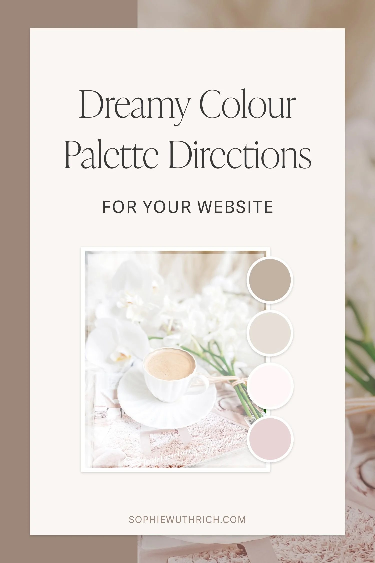
Two Dreamy Colour Palette Directions for your Website
And why your website colours matter
Introducing two dreamy colour palette ideas, along with visual examples of how they can be thoughtfully applied to your website.
Colour is so much more than making things look pretty (though that certainly helps!) When used intentionally, it helps shape how your website feels, how visitors navigate through it, and the impression your brand leaves behind.
Keep reading for two beautiful colour palette ideas, and why your website colours matter.

Colour Palette 01
The first palette has lovely soft pinks and neutral browns, one of my favourite colour combinations (as you can see by my own branding).
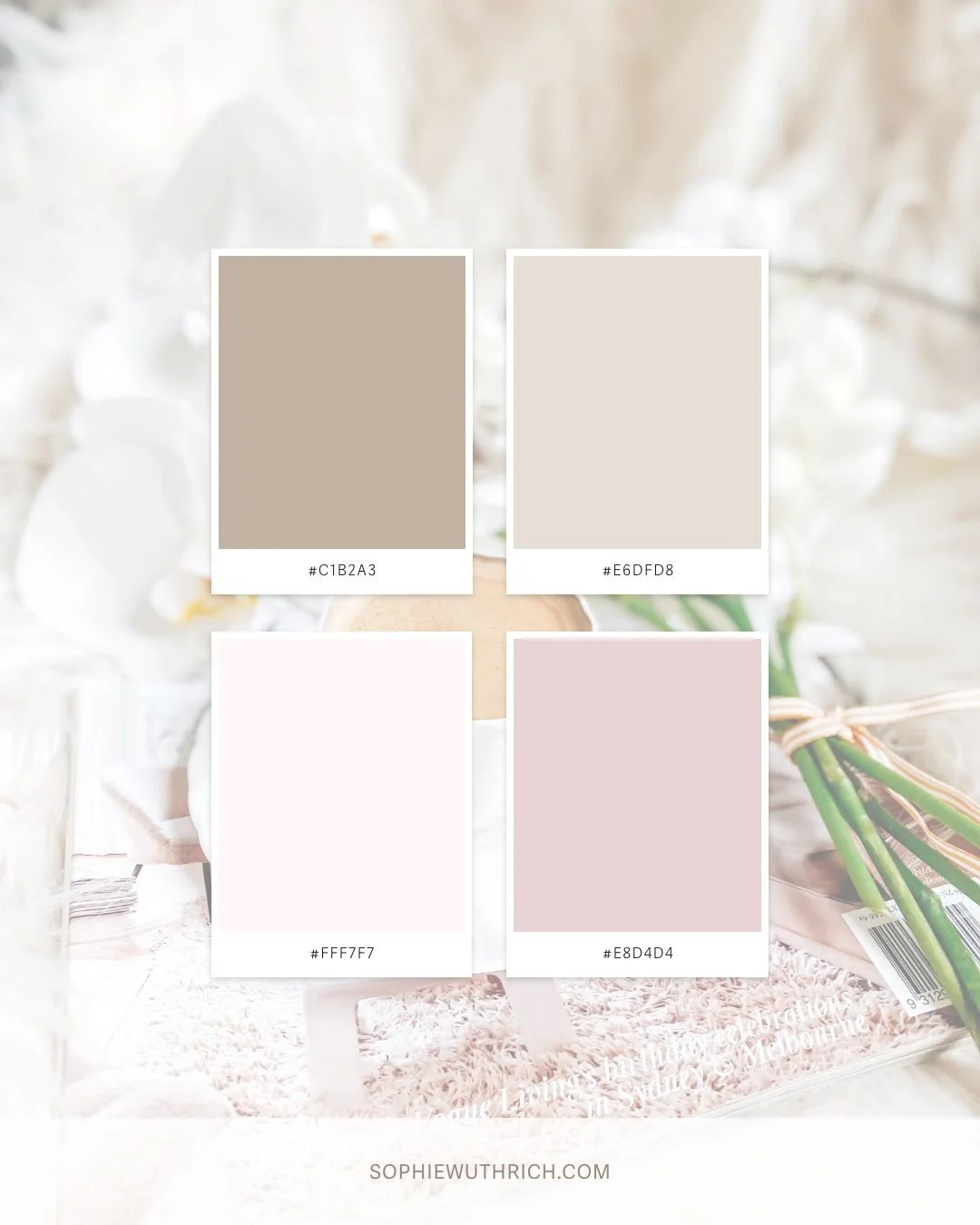
COLOUR HEX CODES:
Top Left: #C1B2A3
Top Right: #E6DFD8
Bottom Left: #FFF7F7
Bottom Right: #E8D4D4
Example Website Colour Application Below


Colour Palette 02
Inspired by cosy picnics, the second colour palette has beautiful muted tones of yellow, green, red and purple.
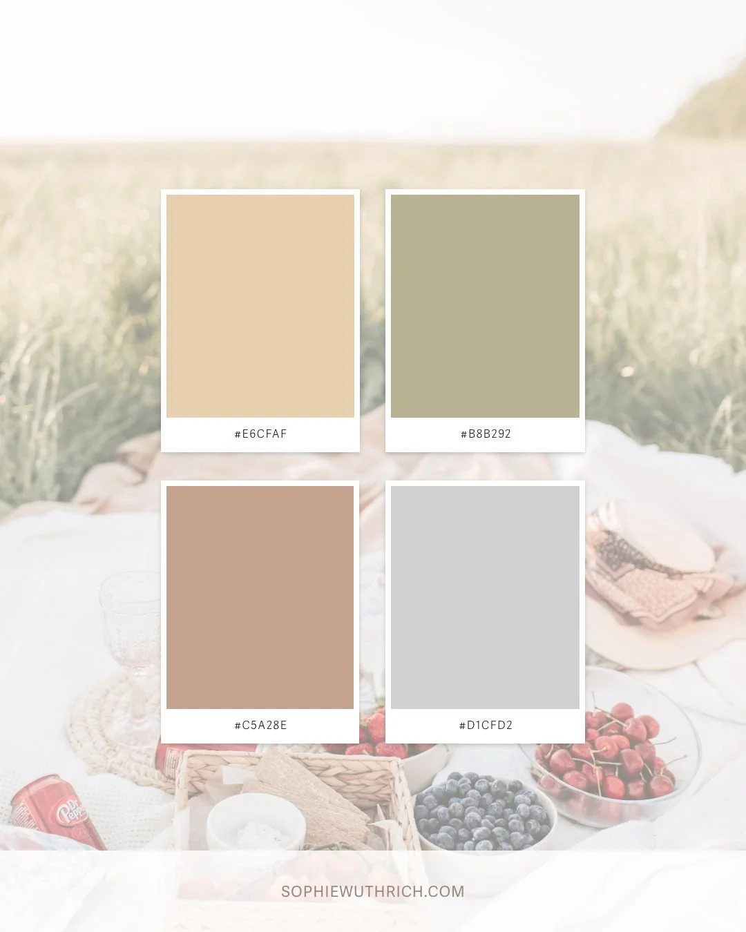
COLOUR HEX CODES:
Top Left: #E6CFAF
Top Right: #B8B292
Bottom Left: #C5A28E
Bottom Right: #D1CFD2
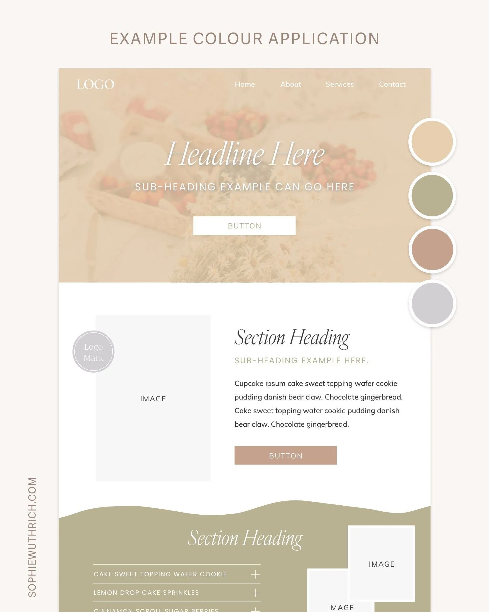
Example Website Colour Application Below
Why your website colours matter.
01 First Impressions
Colour plays an important role in shaping the first impression of your website, giving visitors an immediate sense of your brand’s personality.
In the first website example, I’ve used a solid darker pink in the navigation bar and then a white background in the hero section below. The same four colours are then woven throughout the following sections, creating clear separation between content while still maintaining a cohesive and consistent flow across the design.
In the second website example, I’ve used the yellow from the colour palette and reduced the opacity to create an overlay effect on the hero image, allowing the colour to extend across the entire section, including behind the navigation. This creates a more immersive design and allows the hero section and navigation to feel visually connected.
Colour helps set the tone for the overall feel of your website from the very beginning.
02. Readability
Ensuring sufficient contrast between text and background colours is essential for readability.
A beautiful colour palette is great, but visitors also need to be able to comfortably read the information on your website. In both examples, lighter text is used on darker backgrounds, while darker text is used on lighter backgrounds to maintain clarity and readability. Subtle accents of colour are also used in select areas, such as subheadings, to add depth and visual interest without overwhelming the design.
03. Guiding Visitors
Thoughtfully applied colour can help highlight important information and influence how visitors move through your website.
For example, assigning an accent colour to elements such as buttons can help draw attention to important calls to action and guide visitors towards the next step. Applying different background colours to sections can also help separate content, making information easier to follow and encouraging visitors to continue scrolling through the page.
04. Visual interest
Last but not least, colour is a wonderful way to add visual interest!
Both website examples use colour to add visual interest in various ways. For example using an overlay effect, different section background colours, image borders, branding elements etc. There’s so many possibilities! While there are many ways to incorporate colour to add visual interest, it can be easy to go overboard. So, I like to choose a few intentional applications that best align with the brand and overall website strategy.
I hope this post gave you a better idea of how much intention can sit behind something as simple as a colour palette. When used well, colour becomes a quiet but powerful part of your website’s overall experience.
I’d love to know which palette is your favourite, let me know in the comments below! 🎨
colour palette inspiration images are from Studio Naae and Vlada Karpovich on Pexels.